Summary report of key findings from resident survey
The City Survey objectively assesses San Francisco residents’ use of and satisfaction with various city services every few years. The 2023 survey is the first since 2019 due to the COVID-19 pandemic. The 2023 City Survey is the 18th survey conducted.
See how San Franciscans feel about our City.

-
Resident ratings of most city services decrease from 2019 to 2023
- Government ratings decreased to a C
- Parks and Library ratings both drop in 2023, but remain some of the top-rated City services
- Feelings of safety drop from 2019
- Muni rating is the highest since 2017, but remains lower than ratings for some other City services
- Utilities rating maintains a B+ average
- Streets and sidewalks drops but rating maintains a C+ average
- Respondents are more likely to cite public safety as a top concern than in 2019
- Low income groups use key city services more and rate them higher
-
Survey respondents report feeling less safe in their neighborhoods this year
- Asian or Pacific Islander respondents report the lowest feelings of safety
- Low-income respondents report the lowest feelings of safety
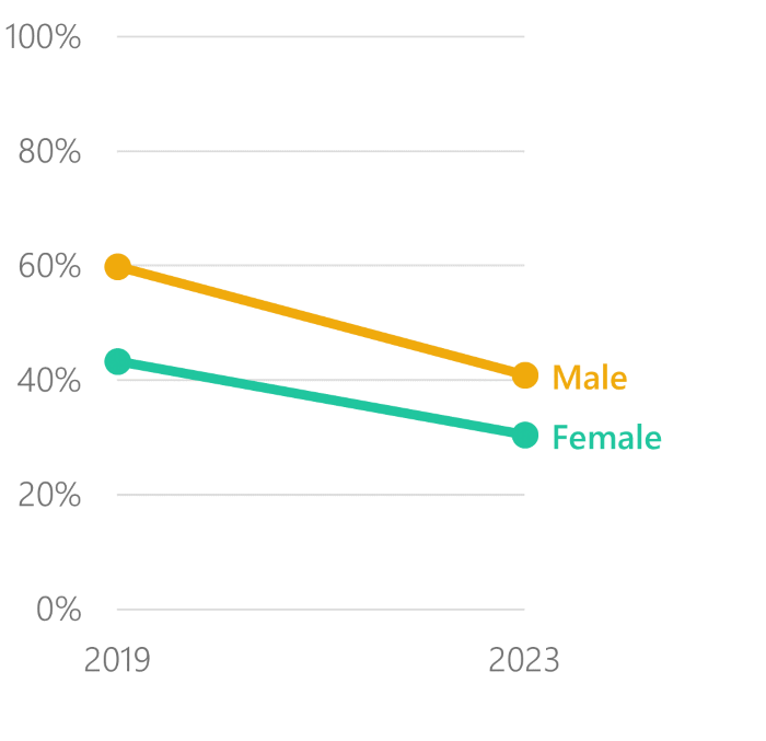
- Female respondents continue to report lower feelings of safety than male respondents
- Residents of most neighborhoods do not feel safe walking alone during both day and night
-
Residents generally approve of the City’s response to the COVID-19 pandemic
- Residents rate the overall COVID-19 response higher than they rate the City’s economic response to COVID-19
- Parents of young children rate the City’s COVID-19 response the lowest
- Ratings of the City’s COVID-19 response differ by age group
- Residents are most likely to say they are doing the same financially compared to before the pandemic
-
COVID-19 has different and often surprising impacts on service usage and transportation preferences
- Park use does not change significantly from 2019 to 2023
- Parents are more likely to use some key City services, such as parks and libraries, than those without young children living with them
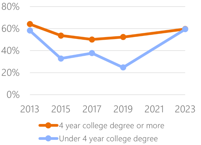
- The gap in online library usage by parents with and without a 4-year college degree closes in 2023
- Muni and public transit use drops slightly from the 2019 survey
- Rideshare use drops dramatically from 2019, while taxi use holds steady
- Safety concerns and commuting changes due to the COVID-19 pandemic have limited impact on resident transit patterns in 2023
- About the 2023 City Survey
- Results Overview
- Find out more
Sections
-
Resident ratings of most city services decrease from 2019 to 2023
- Government ratings decreased to a C
- Parks and Library ratings both drop in 2023, but remain some of the top-rated City services
- Feelings of safety drop from 2019
- Muni rating is the highest since 2017, but remains lower than ratings for some other City services
- Utilities rating maintains a B+ average
- Streets and sidewalks drops but rating maintains a C+ average
- Respondents are more likely to cite public safety as a top concern than in 2019
- Low income groups use key city services more and rate them higher
-
Survey respondents report feeling less safe in their neighborhoods this year
- Asian or Pacific Islander respondents report the lowest feelings of safety
- Low-income respondents report the lowest feelings of safety
- Female respondents continue to report lower feelings of safety than male respondents
- Residents of most neighborhoods do not feel safe walking alone during both day and night
-
Residents generally approve of the City’s response to the COVID-19 pandemic
- Residents rate the overall COVID-19 response higher than they rate the City’s economic response to COVID-19
- Parents of young children rate the City’s COVID-19 response the lowest
- Ratings of the City’s COVID-19 response differ by age group
- Residents are most likely to say they are doing the same financially compared to before the pandemic
-
COVID-19 has different and often surprising impacts on service usage and transportation preferences
- Park use does not change significantly from 2019 to 2023
- Parents are more likely to use some key City services, such as parks and libraries, than those without young children living with them
- The gap in online library usage by parents with and without a 4-year college degree closes in 2023
- Muni and public transit use drops slightly from the 2019 survey
- Rideshare use drops dramatically from 2019, while taxi use holds steady
- Safety concerns and commuting changes due to the COVID-19 pandemic have limited impact on resident transit patterns in 2023
- About the 2023 City Survey
- Results Overview
- Find out more
Resident ratings of most city services decrease from 2019 to 2023
| Government | C |
| Libraries | B+ |
| Parks | B |
| Safety | C+ |
| Police | C+ |
| Muni | B- |
| Utilities | B+ |
| Streets | C+ |
| COVID Response | B |
Ratings for City services in 2023 ranged from C+ to B+. Libraries continue to earn the highest ratings among City services, followed by Utilities.
The Muni grade was the only overall grade to increase since 2019, improving from a C+ to a B-. The grades for Government and Safety decreased the most from the previous survey in 2019. Government ratings dropped from a B- to a C, and Safety ratings dropped from a B to a C+.
Service area grades are shown in this table. Solid gray arrows show significant increases or decreases. Lighter arrows show grades that have changed but which may be explained by changes to survey methodology and sample. This year is the first time the City conducted online and in-person surveys in addition to telephone, to reach a more representative population of SF residents. These mode changes may impact results.
The City Survey asked questions about the City’s COVID response and police for the first time in 2023, so no changes are calculated. In previous years, utility and streets ratings were reported in a combined Infrastructure rating.
Back to topGovernment ratings decreased to a C
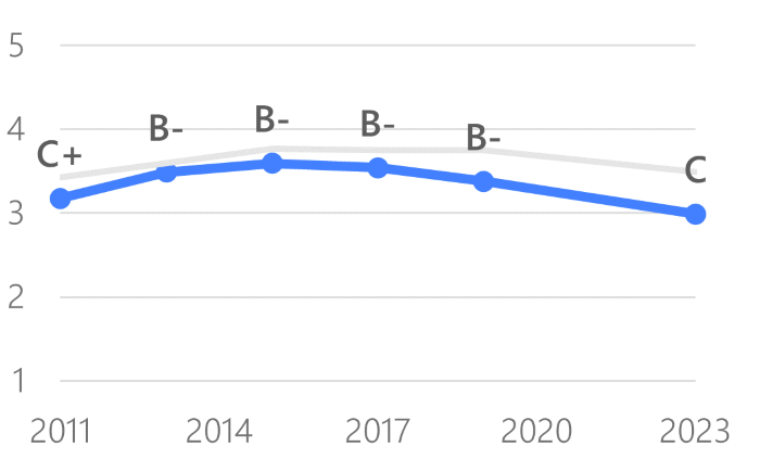
2023 Overall Government Rating: C
Respondents have graded the overall job of local government in providing services since the first City Survey in 1996. This year, respondents reported an average government rating of C (“Average”).
Parks and Library ratings both drop in 2023, but remain some of the top-rated City services
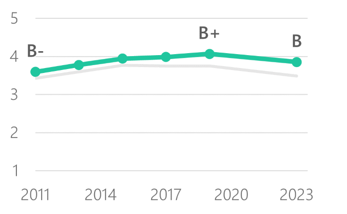
2023 Parks Rating: B
Respondents have rated the overall quality of San Francisco’s parks system since the 2011 City Survey. In the 2023 survey, Parks ratings dropped slightly for the first time in over a decade, from a B+ to a B. Some of this may be explained by changes to survey mode. In 2023, 70% of respondents gave Parks an A or a B grade. This is a drop from 79% in 2019, but reflects that most residents feel positively toward parks.
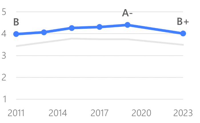
2023 Library Rating: B+
City Survey also asks residents to grade the overall quality of San Francisco’s library system. Library ratings also dropped and have the lowest score since 2011. Libraries remain among the highest rated City services, with 74% rating the libraries an A or a B.
Feelings of safety drop from 2019
2023 Safety Rating: C+
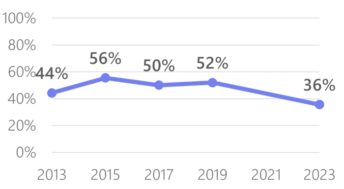
Sixty-three percent of respondents report feeling safe or very safe walking alone in their neighborhood during the day, while just over a third (36%) report feeling safe or very safe walking alone in their neighborhood at night. Both feelings of safety during the day and at night have decreased since 2019, when 85% felt safe during the day and 53% felt safe at night.
Muni rating is the highest since 2017, but remains lower than ratings for some other City services
2023 Muni Rating: B-
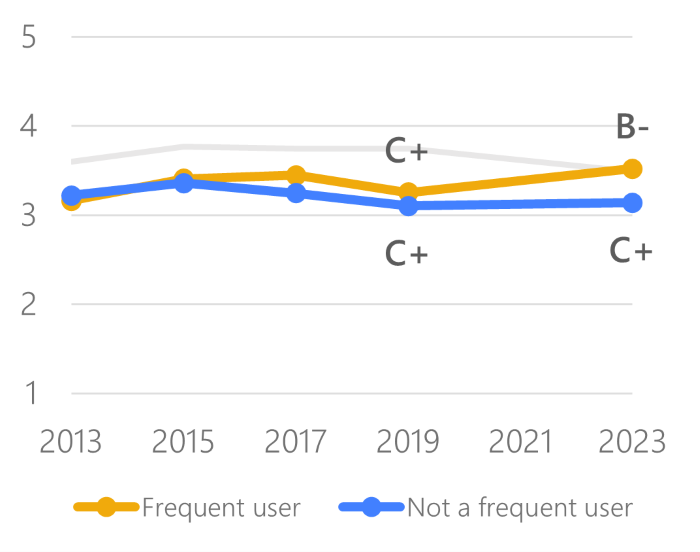
In 2023, the overall Muni rating was a B-, with 46% rating Muni an A or a B. This is the highest grade Muni has received since 2013.
City Survey also asks how frequently residents use public transportation. A frequent user is a resident who uses public transportation at least once a week. Frequent users tend to grade Muni slightly higher than those who don’t ride Muni frequently. This year, that gap widened, with frequent users rating Muni a B- and non-frequent users rating it a C+.
Utilities rating maintains a B+ average
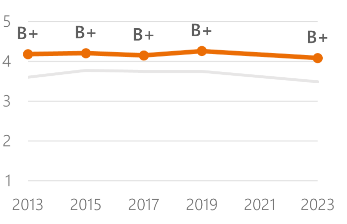
2023 Utilities Rating: B+
Respondents graded the quality of utilities services, and have reported an average rating of B+ (“Good”) since 2013. In 2023 the score drops slightly, possibly due to mode.
This rating averages drinking water delivery, sewer, and stormwater service ratings. In 2023 the City added a rating of CleanPowerSF. This inclusion doesn’t impact changes from 2019.
Streets and sidewalks drops but rating maintains a C+ average
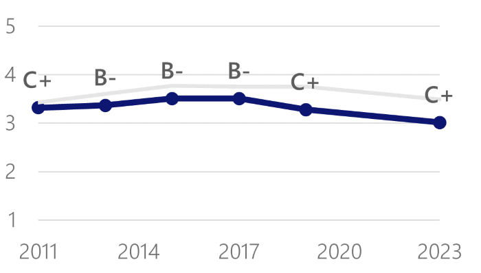
2023 Streets Rating: C+
Respondents grade the quality of streets and sidewalks and report an average rating of C+ (“Average”). Though the score dropped, it remains within the same grade as in 2019.
This rating is an average of streets and sidewalks condition and cleanliness ratings.
Respondents are more likely to cite public safety as a top concern than in 2019
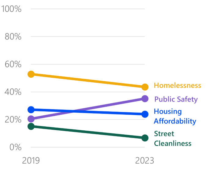
Since 2017, the City Survey has asked respondents to name the most important issues facing the City. Respondents cited the same top four categories of top issues in 2019 and 2023.
Although homelessness remains the most frequently cited top issue among respondents, fewer respondents overall cited homelessness, street cleanliness, and housing affordability as their top issue compared to 2019. Instead, a larger proportion of respondents cited public safety as their top issue. Some respondents provided responses with multiple top issues, so percentages do not add up to 100%.
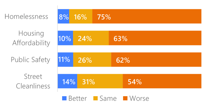
In 2023, respondents were also asked whether the same four issues—homelessness, housing affordability, public safety, and street cleanliness—had gotten better, worse, or stayed the same.
The largest proportion of respondents reported homelessness had gotten worse, at 75%, which is unchanged from those who reported homelessness had gotten worse in 2019. Similarly, 54% of respondents reported street cleanliness had gotten worse in both 2023 and 2019.
Low income groups use key city services more and rate them higher
Back to topLowest income residents are primary users of Muni and rate it higher than other income groups
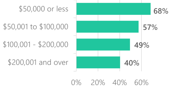
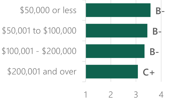
The City Survey asks respondents whether they have ridden Muni in the past year, and also asks more generally about the frequency of their public transit use. In 2023, there were no significant differences in Muni use by income group. However, there were differences in frequent public transportation use by income group. Frequent users use public transportation at least once a week. The lowest income residents are far more likely to be frequent public transportation users than the highest income residents. The lowest income groups tend to also rate Muni higher than the highest income groups.
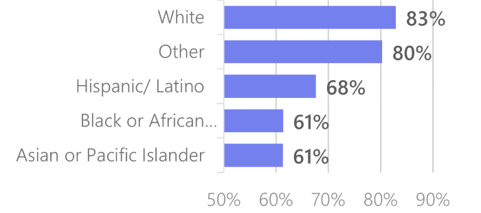
There were no significant differences in Muni use by race when looking at which residents have used Muni in the past year. However, there were differences in frequent public transportation use by race. In 2023, only 48% of White residents indicated that they were frequent public transportation users. Asian or Pacific Islander, Black or African American, and Hispanic, Latino, or Spanish Origin residents all were frequent users at similar rates (54% - 59%), while those who indicated other races or ethnicities reported high usage (79%).
Back to topUsers of most library services are low-income
In 2023 those making $50,000 or less were more likely to be library users than those in other income groups. The highest income groups reported the lowest library usage. In a break from past patterns, the highest and lowest income users rated the library a B+, higher than those in the middle income groups, who rated the library a B. Historically, lowest income users have rated the library the highest while highest income users rate the library the lowest.
Frequent park users are more likely to be higher income
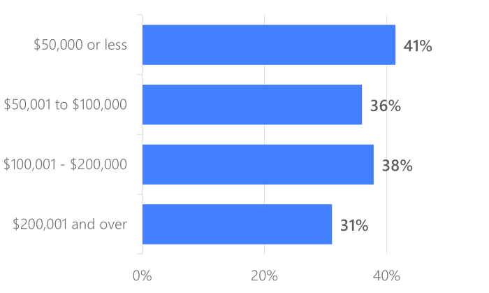
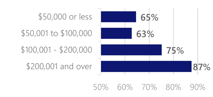
Park users are an exception to this trend of low-income residents being the highest users of services. Frequent users tend to be in the highest income group and are more likely to be White. Eighty-one percent of those with the highest incomes are frequent parks users, compared to only 63% and 65% of residents in the lower income groups. This is a contrast to Muni and Library usage trends. Comparing reasons for non-use for each of these services can help illuminate why there are these diverging use patterns.
Many non-users cite access to alternatives as reasons for not using libraries and Muni
The 2023 City Survey was the first that asked residents who have not used Libraries, Muni, and Parks in the past year why they don’t use that service.
Many cited a lack of interest, need, or time as their primary reason for not using libraries. When digging into responses further, one said that they are “fortunate enough that [they] don’t need the services” while many others said that if they needed books or resources, they would “just buy what [they] need.” This suggests that many of the non-users can purchase the services the library provides and so don’t feel the need to use the public resource.
We are “fortunate enough that we don't need the services.” - Library non-user
Similarly, many Muni non-users had alternate transportation options. Several stated that they don’t use Muni “because [they] have a car” or “have [their] own transportation.” Many said driving is more convenient. Some also said they use rideshare such as Uber or Lyft, micro-mobility options such as Bird scooters, or bikes. These answers show that many who don’t use Muni have other, often more costly, options that they prefer to use.
There is “no need… [I] have my own transportation.”
- Muni non-user
In contrast, parks non-users did not cite use of alternatives as a reason. The majority of non-users cited a lack of time, safety concerns, or having a health issue or disability as a reason for non-use.
These reasons for non-use taken together with different use rates among income groups suggests that lower income residents rely on Muni and Library services in part because, unlike their higher-income counterparts, they either can’t access or aren’t willing to pay for these other private options. The exception is for parks, where there are no widely accessible private alternatives (even higher income groups may not have private backyards due to the high cost of housing in San Francisco), which may be why more privileged groups report higher usage rates.
Back to topSurvey respondents report feeling less safe in their neighborhoods this year
Back to topAsian or Pacific Islander respondents report the lowest feelings of safety
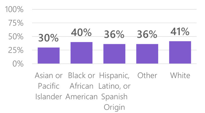
Safety ratings across all race and ethnicity categories have decreased since 2019. Asian or Pacific Islander respondents are least likely to feel safe or very safe walking alone in their neighborhoods during the day and night. This coincides with the reported increase in anti-Asian hate crimes in 2021.
Low-income respondents report the lowest feelings of safety
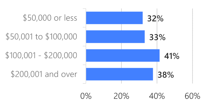
Lower-income respondents continue to report feeling less safe walking alone in their neighborhoods during the day and night compared with higher-income respondents.
The 2019 City Survey showed a similar trend in which respondents in the lowest income group reported the lowest safety ratings, while respondents in the highest income groups reported the highest safety ratings.
Female respondents continue to report lower feelings of safety than male respondents
Both male and female respondents reported decreased feelings of safety since 2019. Female respondents continue to report lower feelings of safety than male respondents. Note that the male and female categorizations throughout the survey include those identifying as Trans and those not identifying as Trans.
Genderqueer, Non-Binary, and Not Listed options were available in the 2019 and 2023 surveys, but the number of respondents selecting these categories were not high enough to reliably report responses here. In addition, the majority of LGBTQIA+ respondents reported gender and race/ethnicity categories associated with higher safety ratings (Male, White), which made it difficult to determine if LGBTQIA+ respondents report different levels of safety from other respondents.
Residents of most neighborhoods do not feel safe walking alone during both day and night
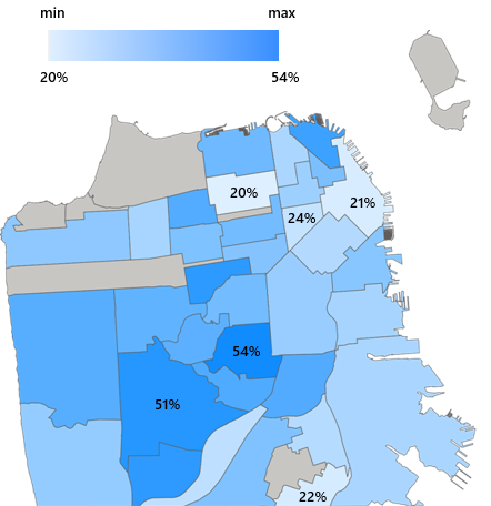
In most neighborhoods, between 25-50% of respondents reported feeling safe walking alone during the day and night.
In Noe Valley and West of Twin Peaks, at least half of respondents reported feeling safe walking alone during the day and night.
In Pacific Heights, Financial District/ South Beach, Visitacion Valley, and Tenderloin, under a quarter of respondents reported feeling safe walking alone during the day and night.
For more detail on neighborhood ratings visit the Neighborhoods Dashboard.
Residents generally approve of the City’s response to the COVID-19 pandemic
Back to topResidents rate the overall COVID-19 response higher than they rate the City’s economic response to COVID-19
Overall COVID-19 response: B
Economic response to COVID-19: B-
The 2023 City Survey was the first conducted since the onset of the COVID-19 public health emergency in early 2020. The 2023 survey asked residents to grade the City’s approach to the COVID-19 pandemic.
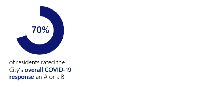
Residents generally responded positively to the City’s overall response to the COVID-19 pandemic. The overall grade was a B, tied with Parks as the second highest rating for government services in the 2023 City Survey.
Seventy percent of respondents rated the response an A or a B, indicating they generally felt positively about the way the City handled the COVID-19 pandemic, lockdown, and re-opening. There were few differences in ratings when analyzing responses by gender, race, income, LGBTQIA+ identity, or disability status.
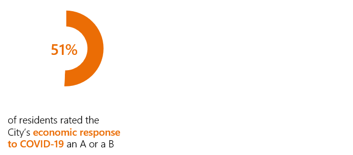
Residents rated the City’s economic response to COVID-19 lower than the overall response. The City Survey asked residents to grade the City’s economic response, which included supporting both residents and small businesses. Economic response received a B- rating, and 51% of residents gave it an A or a B. The highest-income residents rated the economic response the lowest.
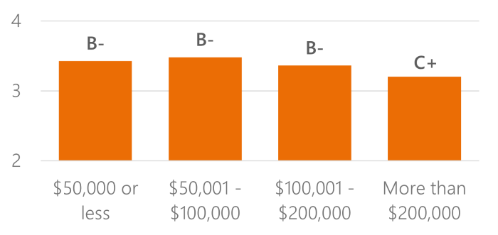
Parents of young children rate the City’s COVID-19 response the lowest
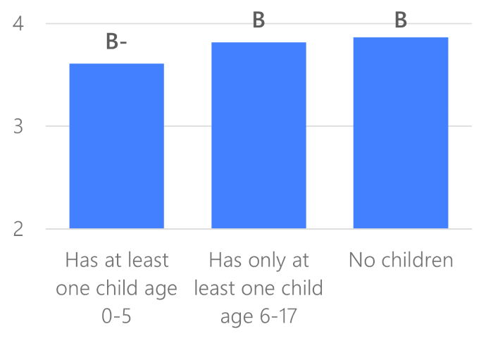
Overall, most demographic groups rated the City’s response to the COVID-19 pandemic similarly. However, there were some differences in ratings by age group and the age of a respondent’s children.
Respondents with children ages 0-5 rated the City’s COVID-19 response lower than those without children living with them and those who only have children ages 6-17. Data from the California Child Care Resource and Referral network show that the combined safety and financial impacts of the COVID-19 pandemic caused childcare center closures in San Francisco. In early 2022, CBS Bay Area reported that these closures combined with rising inflation has made paying for childcare untenable for many Bay Area parents. Because school-aged children have now returned to public and private grade schools, this may be an underlying cause of these differences in ratings.
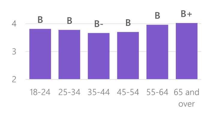
Ratings of the City’s COVID-19 response differ by age group
The impact of the pandemic on parents may also be why there are differences in COVID-19 response ratings by age. Those in the 35-44 and 45-54 categories rated both the COVID-19 overall response and COVID-19 economic response the lowest. These are the age groups that are the most likely to have children living with them. Older adults (ages 65+ and ages 55-64) rated the COVID-19 response higher than other age groups did. This may be an indicator that older adults, who are generally at higher risk from COVID-19, felt more supported by the City during the pandemic than younger residents did.
Residents are most likely to say they are doing the same financially compared to before the pandemic
City Survey asked residents to report how well they are doing financially in comparison to before March 2020. Forty-five percent of respondents said they are doing about the same, while 30% said worse and 25% said better. Breaking down the results by demographics doesn’t show many clear patterns. For some groups, the percentage who say that they are worse off and the percentage who say they are better off are both higher than the overall survey rates. Because there aren’t clear trends in one direction, it’s difficult to use this data to understand how the COVID-19 pandemic has impacted resident perceptions of their financial states.
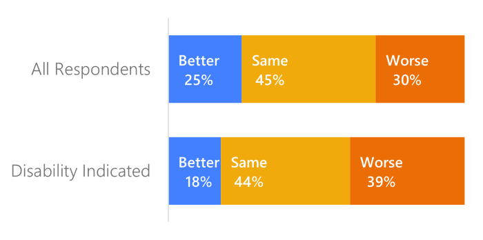
The exception is residents who indicate that they have any functional limitations or disabilities. They are more likely to say they’re worse off financially, with 39% compared to 30% of all respondents. This suggests that San Franciscans with disabilities may be continuing to feel the financial impacts of the pandemic more than San Franciscans who did not indicate that they have a disability.
Back to topCOVID-19 has different and often surprising impacts on service usage and transportation preferences
Back to topPark use does not change significantly from 2019 to 2023
During the initial lock-down during the pandemic, residents often used parks as one of the few ways to get out of the house. However, that spike in usage either dissipated by the time the 2023 survey was fielded or is otherwise not reflected in the City Survey data. The proportion of respondents who go to parks at least once a week fell slightly from 75% in 2019 to 72% in 2023, but the difference is largely explained by changes in the demographics of respondents.
Back to topParents are more likely to use some key City services, such as parks and libraries, than those without young children living with them
As reported above, parents faced unique challenges in the pandemic as daycares closed and schools moved to virtual learning. This impact is reflected in the usage data for several City services. Past City Surveys showed that parents of children of all ages were higher users of parks and libraries. Furthermore, trends among parents and non-parents tended to be similar: if one group’s usage dropped so did the others’.
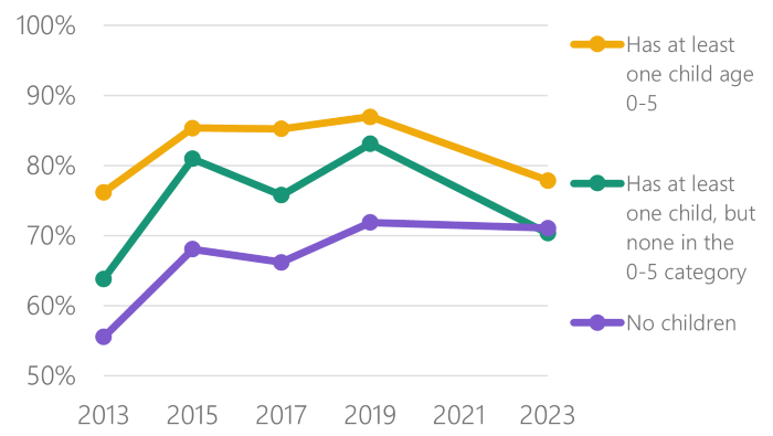
In 2023, parents are still generally more likely to be frequent park users, but there were different trends from 2019 to 2023. Frequent park use (going at least once a week) for parents dropped, while use for non-parents remained flat. Park use among parents with children ages 0-5 remained the highest among the three groups while park use rates for parents of children ages 6-17 and non-parents converged. Both groups of parents saw significant drops in frequent use. While this tracks with overall survey trends of decreasing use, the fact that the small decrease in overall use appears to be driven by parents is a surprising result.
Back to topThe gap in online library usage by parents with and without a 4-year college degree closes in 2023
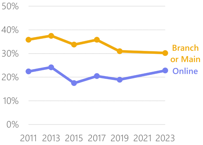
Historically, parents are higher users of all library services than non-parents. Prior to 2023, residents with less than a 4-year college degree used online library services less than residents with a 4-year college degree. This year’s City Survey looked at the intersection of these two groups to determine how the pandemic may have influenced behavior. In 2023, the gap between online usage rates for parents by education-level closed. This is likely an impact of the pandemic.
This trend holds when looking at changes in overall online-library service usage. From 2019 to 2023, there was no statistically significant change in frequent use of branch or main library services, however there was an uptick in online library service usage.
Muni and public transit use drops slightly from the 2019 survey
Muni service was drastically impacted by the COVID-19 public health emergency. Routes were cut in early 2020 and full service was only restored in mid-2022. Despite this disruption, there appears to be minimal lasting impacts on overall Muni usage among residents. In 2019, 84% of residents had used Muni at least once in the past year while in 2023, 83% had.
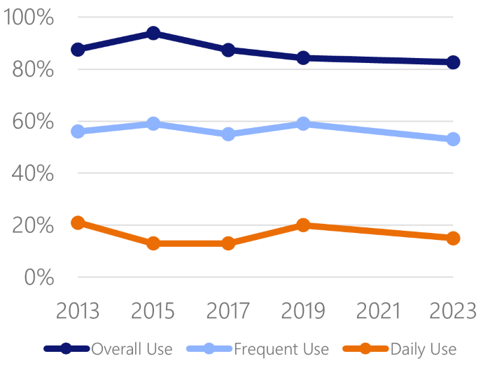
There are larger changes in usage when looking at frequent or daily public transportation users. The proportion of respondents that are frequent users, meaning that they use public transit at least once a week, decreased. This rate dropped from 59% in 2019 to 53% in 2023. Similarly, the number of people who said they use public transit daily dropped from 20% to 15%. This usage rate is not unprecedented: daily usage is higher in 2023 than it was in 2015 and 2017. Comparing the City Survey Muni and public transit usage data to the Muni daily ridership numbers, this is surprising survey result. In December 2022, Muni’s average weekday ridership was still only 55% of December 2019’s average weekday ridership.
Back to topRideshare use drops dramatically from 2019, while taxi use holds steady
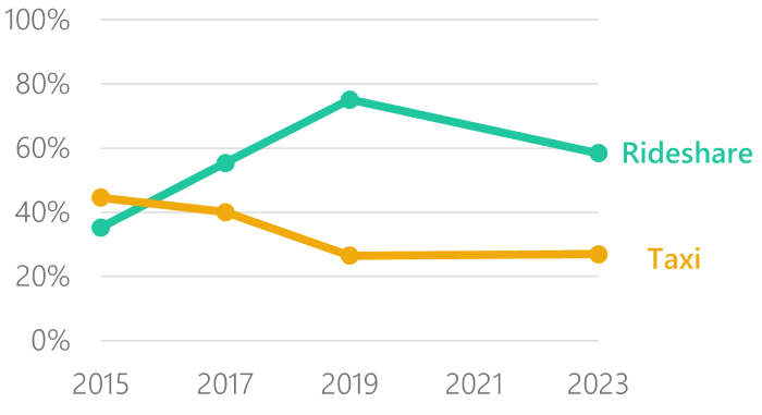
In 2019, there appeared to be a clear trend in the rising popularity of Lyft and Uber and the decline in taxi use in San Francisco. This trend changed in 2023. Rideshare use dropped for the first time since it was added to the City Survey in 2015. The percent of respondents who used a rideshare in the past year fell from 75% in 2019 to 58% in 2023, on par with 2017 usage. In contrast, in 2019 taxi use showed a clear downward trend. In 2023, this trend stopped, with 2023 usage rates remaining at around 27%, on par with 2019 rates. However, while the trends are changing, rideshare remains a more popular option for San Franciscans than taxis.
Back to topSafety concerns and commuting changes due to the COVID-19 pandemic have limited impact on resident transit patterns in 2023
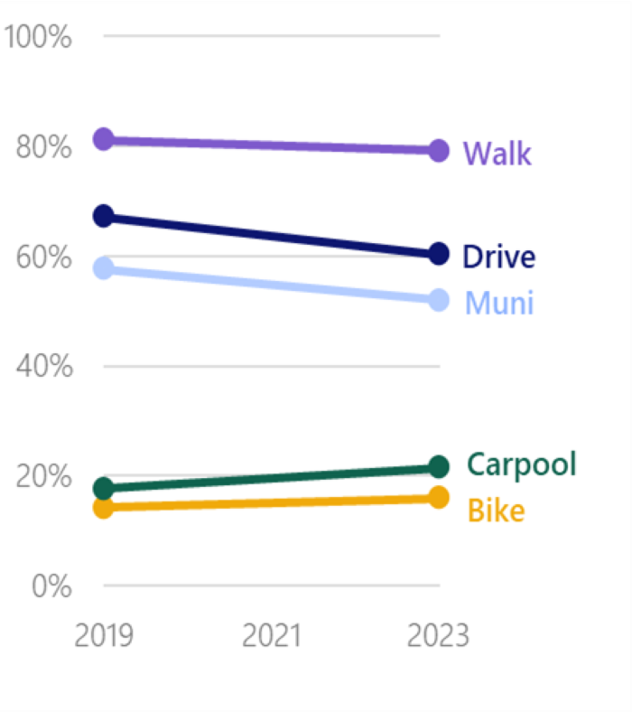
This graph shows the percent of residents who reported that they use each mode of transportation at least once a week. Except for rideshare, as shown above, there were no drastic changes in resident preferences for mode of transportation. Walking and driving remain the most popular frequent transportation options. While public transportation use decreased in 2023, it remains one of the most frequently used transit options.
This is a surprising finding compared to what is seen with Muni and BART ridership numbers, which remain much lower than pre-pandemic. This suggests that small changes in resident behavior may not show up in this measure but can still have significant impacts on ridership. For example, if someone uses public transportation to commute, but works from home three days a week after pandemic lock-down, their use would drop from every work day in 2019 to only two days per week in 2023. They are still a frequent rider, but use that mode less than half as often as they were pre-pandemic. These types of stories may account for the differences seen in changes in overall ridership numbers versus changes in individual behavior.
Back to topAbout the 2023 City Survey
Between October and December 2022, the City and County of San Francisco surveyed 2,530 San Francisco residents on their use of and satisfaction with City services. InterEthnica and EMC Research administered the survey online, over the telephone, and in-person.
Residents answered questions about how frequently they use city services and infrastructure like the library, Muni, public safety, and street cleanliness, and rated their satisfaction with those services. This year residents also responded to questions about the City’s response to the COVID-19 public health emergency. Ratings are scored on a scale of A-Excellent to F-Failing.
This was the 18th iteration of the City Survey, which has been implemented since 1996. The last survey was in 2019; an expected 2021 survey was canceled due to the COVID-19 public health emergency.
Back to topSurvey respondents closely mirror the population of San Francisco
The City Survey works to sample respondents to mirror the demographic characteristics of San Francisco residents as closely as possible.
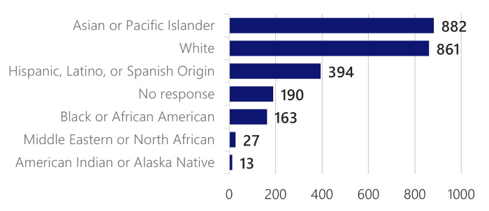
Survey respondents reported races and ethnicities that closely mirror recent census data. Due to a survey error, race and ethnicity was offered with only a single selection option. This means a number of respondents who may have preferred to report multiple races or ethnicities will not have been able to do so. The firm implementing the City Survey reviewed similar surveys they have implemented in the past and reported that they generally see between three and eight percent of respondents who report multiple races or ethnicities when given the option, and prior iterations of the City Survey have had approximately 10 percent report more than one, which provides an estimate for the potential level of inaccuracy in the current data. In future years the survey will return to allowing respondents to select multiple options.
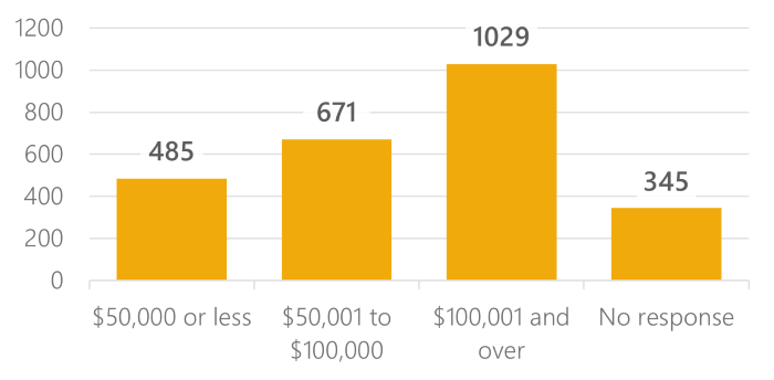
Approximately 60 percent of respondents have completed a four year college degree or more. Nineteen percent of respondents had an income under $50,000 per year and 41 percent had an income over $100,000.
Survey respondents were equally likely to be female and male, and one percent reported being genderqueer, non-binary, or other. Sixteen percent of respondents are LGBTQIA+.
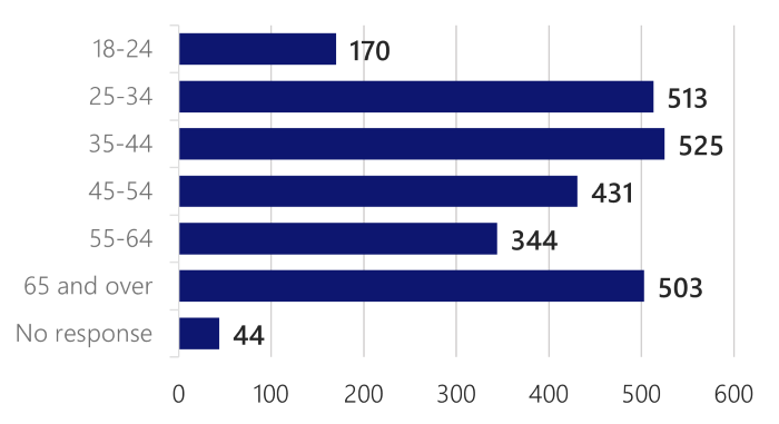
Survey respondents reported having lived in San Francisco for a median of 21 years. Twenty percent were over 65 years old, while 27 percent were under 35. Twenty-nine percent of respondents reported having at least one child under 18. Eleven percent of respondents identified as part of the disability community.
Back to topThe City made changes to the 2023 methodology that impact interpretation of some results
Over the years the City has updated the content of the survey and how residents are sampled and contacted to make sure the City Survey is providing accurate and relevant information about how City residents feel. When the survey began in 1996, residents responded to the survey by mail. In the 2010s the survey transitioned to be telephone based, and this year the City updated the methodology again to include online and in-person options. These changes took into account changes in how people communicate and prefer to answer questions, and allowed the City to reach a more representative sample of San Francisco residents, including younger respondents and non-white respondents who were sometimes underrepresented in previous surveys.
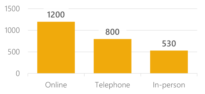
1,200 responded online, 800 by telephone, and 530 responded to in-person surveys on the street. Respondents over 65 are more likely to respond by telephone or in-person. White respondents are more likely to respond online, and Asian and Pacific Islander, and Hispanic or Latino respondents are less likely to have.
These changes improve the quality of the survey results and set the City Survey up for success in the future. They also make it harder to interpret changes in survey ratings between 2019 and 2023. Changing the methodology and sampling can also change how residents rate services. On average, respondents online rated services somewhat lower, while in-person responses are somewhat higher.
Back to topHow to interpret the results
Most outcomes in the City Survey are ratings with the grade associated developed by averaging responses to create a mean score using a five-point grading scale (A+ equals five points and F equals one point).
Numeric to letter grades
| Letter Grade | Lower Mean | Upper Mean |
|---|---|---|
| A+ | 5.00 | 5.00 |
| A | 4.67 | 4.99 |
| A- | 4.33 | 4.66 |
| B+ | 4.00 | 4.32 |
| B | 3.67 | 3.99 |
| B- | 3.33 | 3.66 |
| C+ | 3.00 | 3.32 |
| C | 2.67 | 2.99 |
| C- | 2.33 | 2.66 |
| D+ | 2.00 | 2.32 |
| D | 1.67 | 1.99 |
| D- | 1.33 | 1.66 |
| F | 1.00 | 1.32 |
The three main ways the City reports the results are with a weighted mean from this scale, the corresponding letter grade, or the weighted percent of respondents who graded a service an A or B. Weights are used in the reporting to control for any differences between the demographics of the respondent sample and the overall population of San Francisco.
Results in this report for previous years may not match the exact number from earlier publications. Over the years the City modified exactly where and how weights are used in calculating outcomes depending on what is most appropriate for the most recent data. This year the City increased the use of weights across the reporting. In addition, the exact calculation for reporting the percent of respondents grading a service an A or B has been slightly adjusted this year. Finally, while most service ratings are now based on a single, overarching question, some are based on the average of multiple rating questions. The exact questions used to calculate ratings have changed over time, though the City has worked to keep year over year comparisons are similar as possible.
For more detailed information please see the full dataset and dictionary or the detailed methodology.
Results Overview
Overview of grades and ratings from 2023 City Survey
|
Metric |
Grade |
Rating |
|---|---|---|
|
Overall job of local government in providing services |
C |
2.99 |
|
Reliable delivery of drinking water |
B+ |
4.20 |
|
Reliable sewer and stormwater services |
B |
3.99 |
|
Green power through CleanPowerSF or Hetch Hetchy Power |
B+ |
4.13 |
|
Cleanliness of streets and sidewalks in your neighborhood |
C |
2.78 |
|
Condition of sidewalk pavement and curb ramps in your neighborhood |
C+ |
3.14 |
|
Condition of the street pavement in your neighborhood |
C+ |
3.13 |
|
Overall quality of the City’s recreation and park system |
B |
3.86 |
|
Overall quality of San Francisco’s Library System |
B+ |
4.01 |
|
Overall quality of Muni |
B- |
3.35 |
|
Quality of police services in your neighborhood |
C+ |
3.10 |
|
Feelings of trust in San Francisco police officers |
C+ |
3.21 |
|
City’s overall response to the COVID-19 public health emergency |
B |
3.82 |
|
City’s overall economic response to the COVID-19 public health emergency |
B- |
3.35 |
|
Feelings of safety while walking alone in your neighborhood during the day |
B |
3.68 |
|
Feelings of safety while walking alone in your neighborhood at night? |
C |
2.96 |
Find out more
Find out more with these data dashboards on Overall Government Services, Safety and Policing, Muni and Transportation, Streets and Sidewalks, and Neighborhoods.
Visit the City Survey homepage to see information on past years
Download the full dataset
Back to top
